Showing posts with label Techniques. Show all posts

Saturday, October 30, 2010

World Card Making Day 2010


Yipee, it is weekend, thank goodness!!  Apologies for being a bit erratic with my posting lately, life has got in the way of my crafting in a big way.  It is usual for this time of year in our house.

I have decided to stop doing the technique posts on a Sunday for a while but will continue with Tips for Beginners on a Saturday and resume the technique posts next year.  I will also be pre-scheduling lots of posts this weekend so my blog will still be active even if I am not blogging "live".

I am sharing another of our World Card Making Day 2010 workshops today.  Amanda Harrod showed  us how to age silver cardstock by sponging black acrylic paint over the embossed page.  The left hand sample is without paint and you can see the great result you get after adding the paint.

Have a wonderful weekend everyone!

Sunday, October 17, 2010

Techniques - Isoprophyl Alcohol backgrounds

Isoprophyl Alcohol backgrounds are one of my favourite backgrounds and are really quick and easy to make.

Lay newspaper on your work surface and wear disposable rubber gloves as the inks stain.

Use very glossy card like white Chromolux.

Take a small sponge and wet it with the Isoprophyl alcohol that you buy at a chemist and then Penguin office inks which any stationery store should have in stock.
Smear the sponge over the card. Do the same with other colours if you want to add depth.

The inks come in many colours and I usually use 2 co-ordinating ones, here I used turquoise and violet.

Have a wonderful week!  I heard on the radio this morning that it is 10 weeks to Christmas, what a scary thought.

Sunday, October 10, 2010

Techniques - Adirondack Acrylic Paint Backgrounds

Adirondack Acrylic Paint Daubers make fabulous quick and easy backgrounds and their colours are beautifully vibrant. They dry incredibly quickly too. For making backgrounds there are 2 different methods, simply drag the sponge on the bottle across your card in parallel lines and the other you make little random "splotches" on your tag. They look like a mess until you overstamp them. I stamp images using Brilliance Black.  This technique is fabulous for 10 minute cards.

Hope you have a good week.  We are back to winter in Cape Town with typical wet, cold and windy weather.

Tuesday, October 5, 2010

Direct To Paper Technique

Direct to paper technique (DTP) is extremely popular, it adds so much to your cards and you could well become addicted to direct to paper inking! I almost always add some ink to my projects!

 
Direct to paper technique is very easy and all you need is an ink pad and a sponge. Some people apply the ink directly from the ink pad onto the card but I find that it can become messy and your colour can be too dark. I prefer to pick up some ink on a sponge and then sponge the card, you have better control this way.

 
The Tim Holz Ink Essentials blending tool is great for this technique. It is a handle with a Velcro attached foam strip, you can buy packs of 10 foam blocks so that you have a few for different colour. A cheaper option is to buy Cut ‘n Dry foam and mount it onto wooden blocks or start with any little sponge. I find that the specialist foam does give a better finish though.

 
There is no right or wrong way, it is very much your personal preference, as with all artwork. I recommend practicing on scrap paper to get the look you desire before trying it directly on your project the first time.

 
Direct to Paper Technique Ideas:
  • Ink edges of cardstock, accents, edges of photos, die cuts, edges of Vellum, torn edges.
  • Crumple paper and then smooth out and ink around all of the rough surfaces.
  • Try experimenting with different colors for a different look.
  • The way you hold your sponge or inkpad will give you different finishes. By leaning the pad at a sharper angle to your paper, you'll get more ink on your design.

If you like the shabby chic look then you will love the way direct to paper inking looks. It just adds so much dimension to your layouts. Even a neat clean line scrapbook page can be softened up by just a little ink on the edges.
 
Have a happy day!


Sunday, September 26, 2010

Techniques - coffee/tea staining

[20+Apr+09+010.jpg]


Hi everyone!  I am feeling grotty today and hope it passes soon. 

I have decided to start my weekly post of techniques with something very simple and we usually have the ingredients at home, so no need to go out and buy anything for this one.

If you look closely at my altered tag you will see that I used a page from an old book and I gave it a vintage finish.  This was achieved by making a strong cup of coffee and sponging the coffee onto the paper and allowing it to dry.  If your paper curls  just simply press it under a heavy book for a day or two. Experiment with the colour that you want to achieve, stronger coffee makes a darker stain and a tea stain is not so brown.

With tea staining you can use the leftover tea bag instead of a sponge but be careful that you handle the bag with care so that it does not split.

Hope you have fun with this inexpensive technique and an easy way to age paper to obtain a vintage look.

Have a happy day!

Thursday, April 8, 2010

Artistic Envelope - Autumn


Here is a photo of the technique that I used for the background on my envelope. I used 3 shades of Adirondack Acrylic daubers - butterscotch, terracotta and copper. I decanted a little paint into 3 Ranger mini mister bottles added water and misted the envelopes with the paint.

Wednesday, March 17, 2010

ATC - "M" is for music

Another alphabet swap where we had to make 18 ATC's. Here I have used Adirondack acrylic daubers - copper, cranberry and raspberry, this time I swiped them across the cardstock. Once the paint has dried I overstamped the background with Brilliance black ink and the
Crafty Individuals stamp. The ATC is embellished with black velvet ribbon, a lace flower and pink diamante.
Thank you for visiting my blog and taking the time to e-mail me and comment on my posts, it is much appreciated!

Monday, March 15, 2010

ATC - "L" is for leaves

Happy Monday everyone, hope this week is a great one for you!

Here is my contribution to the alphabet swap letter L. I thoroughly enjoyed making this one. I am really having fun "playing" with my Adirondack acrylic daubers that Amanda introduced us to at World Card Making Day. I am already thinking about the next exciting 2010 WCMD as the last one was fabulous!

I used lettuce and copper daubers on cream cardstock to create the background and overstamped it with 2 PSX leaf stamps in Brilliance Pearlescent Chocolate and Coffee Bean inks. I tore the page of an old book and glued it to the ATC with an old South African postage stamp which was cancelled with a post office stamp from Dark Room Door Venetian collection. The edge of the card was sponged with Brilliance Pearlescent chocolate and it is mounted onto brown textured card.

Monday, February 22, 2010

Artistic Envelope Challenge

This is my contribution to an Artistic Envelope challenge. 15 ladies participated and we had to decorate a C5 envelope for each one of them and one for a local magazine for possible publication. They were all posted on 15 February and everyone should have received their by now.

The images are from a Dark Room Door set of red rubber stamps called Venetian collection. I love the quality of the stamps as the images come out so incredibly clearly and are very detailed. I am able to supply you with Dark Room Door stamps if you want any. The black images are stamped in black Brilliance.

After World Card Making Day in October last year I was very taken by the Adirondack Acrylic Paint Daubers and got a whole lot for Christmas from my family. But life has been so hectic that I had not used them yet and this was a good opportunity to try them out.

I painted white card with the Lettuce dauber and over stamped it with black Brilliance and a frame stamp. I cut the frame out and mounted it over the computer printed address on the envelope. I also coloured wording by dabbing the dauber sponge onto the stamp and quickly stamping it onto the envelope. The paint dries quickly so you need to work fast when stamping with it.

Thursday, February 11, 2010

Isoprophyl Alcohol technique on acetate


Butterflies are a favourite of mine and I have a big collection of butterfly stamps. This stamp is a Tin Can Mail one and is coloured with Radiant pearls and the acetate with Penguin office inks and Isoprophyl Alcohol. The metal butterflies are painted with Alchol Ink.

Have a happy day!

Tuesday, February 9, 2010

Black pearl technique


This card shows the Black Pearl technique. You take a piece of roller towel and split the layers. Put the thin layer onto a styrofoam veggie/meat punnet and gently sponge it with craft paints including a metallic colour. Allow it to dry and then peal it off to reveal a gorgeous background paper. If it is too uneven then flatten it with a book. The butterfly collage image is a Tin Can Mail stamp from Inkadinkado and has been sponged with radiant pearls, the vertical Happy Birthday is from Stamp n stuff.

Monday, January 25, 2010

Credit card technique

Happy Monday everyone! I am so grateful for the comments that you leave on my blog. I often try and leave comments on blogs but find it very frustrating as they don't always appear or they take forever to load. But I really enjoy reading your blogs and getting to know you better.

I am sharing an a card that I made a few years ago, the background paper is wrapping paper. The image of the lady is a by South African company called Great Impressions, they have a lovely range of wood mounted stamps. The gold paper is made using the credit card technique where you crumple the brown card that comes in the middle of wrapping paper rolls, then spritz it with water and apply acrylic paint smearing it with an old credit card. The card is finished off with a skeleton leaf and paper rose.

Monday, November 30, 2009

Isoprophyl Alcohol technique

I am back on track again, it is amazing how quickly a backlog of things mounts up when you are busy with other activities. But feel like I am catching up quickly now.


I am sharing a birthday card with you today. If I am critical about it, I feel that it is too busy, but I still enjoyed making it. White folded cardstock with very pale lilac cuttlebugged card mounted onto it. The image is from an Impression Obsession clear set and I stamped it in black Memories onto an Isoprophyl Alcohol background, it is mounted onto white, then lilac and then aqua cardstock. The corners are embellished with tiny punched flowers with bling centres. The card is finished off with Cuttlebug die cuts embellished with tiny bling circles in the centres of the flowers.


Isoprophyl Alcohol backgrounds are one of my favourite backgrounds and are really quick and easy to make.


  • Lay newspaper on your work surface and wear disposable rubber gloves as the inks stain.

  • Use very glossy card like white Chromolux.

  • Take a small sponge and wet it with the alcohol and then Penguin office inks.

  • Smear the sponge over the card. Do the same with other colours if you want to add depth.

  • The inks come in many colours and I usually use 2 co-ordinating ones, here I used turquoise and violet.

Wednesday, October 7, 2009

Adirondack Daubers


I just love the Adirondack Acrylic Paint Daubers that Amanda demonstrated to us on WCMD. And a lot of you have been asking why I am trying to get them. After a lot of searching I have found them at Paper World in Jhbg at R33 for non-metallic colours and R47 for metallic. The one photo is of Amanda's samples on our work table and the other is of the cards that I made using this product. They make fabulous quick and easy backgrounds and their colours are beautifully vibrant. They dry incredibly quickly too. For the backgrounds there are 2 different methods, simply drag the sponge on the bottle across your card in parallel lines and the other you make little random "splotches" on your tag. They look like a mess until you overstamp them. This technique is fabulous for a 10 minute card.

Sunday, April 26, 2009

Altered Tag

This is my latest creation for an “Artistic Woman Altered tag swap”, there are 30 participants in the swap and the hostess is binding the tags into a book for us. The focus on the tag had to be on paper, stamping and techniques with no embellishments except staples, brads or buttons. I found it quite a challenge initially as I love my ribbon and embellishments, but once the design was complete I was happy with the result. When the book is returned I will take photos and upload them for you to look at.

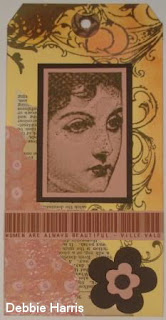
I worked on large shipping tags – 160mm x 80mm (6.3” x 3.2”) and used Basic Grey clear flourish edge stamps which I stamped in Vivid Taupe onto the tag. I sponged around the edges of the tag with the same ink and added a touch of Vivid tea rose ink sponging on the flourishes. Another technique used was coffee staining pages from an old book which were torn roughly using a Plaid decorative Edge ruler, the scrapbooking paper was also torn in this manner.

The beautiful face is from a Frantic stamper grab bag and was stamped with Vivid taupe ink on pink card and matted onto brown. The quote from Quote Garden was typed up in barcode font.

The flower embellishment was made using a Cuttlebug flower die.

This is the reverse side of the tag:

Again I sponged the edges of the tag with Vivid taupe ink. The corner flourish, a clear stamp by Autumn Leaves, was stamped with the same ink. The flourish was sponged with Vivid tea rose.

The image is from a clear Build a frame collection set by Prima and this was stamped using the Vivid taupe ink onto a sheet of torn wallpaper.

The tag is embellished with a cuttlebugged flower and a strip of digital paper flower pattern from Gina K Designs.